Course: Parsons School of Design Navigating the Field
Type: Coursework
Role: UX Designer
Year: 2023
Brief: Reflecting upon my journey at Draper University's Startup Accelerator during my junior year, I came to realise the power of education technology in aiding those across the world. With a desire to carry this over into my academic studies, Edufi was born.
The aim was to develop a multifunctional app that singularises educational content for children. In an increasingly globalised world, with the diversification of educational content, this platform aims to seamlessly explore the potential of user experience design and strategy in allowing multi dimensional educational content access to all children with just one swipe.
Personally, while bringing in my passion for education technology, it was imperative that the foundations of this project were entirely separate from the work pertaining to our Draper Team to honour my team and our work.
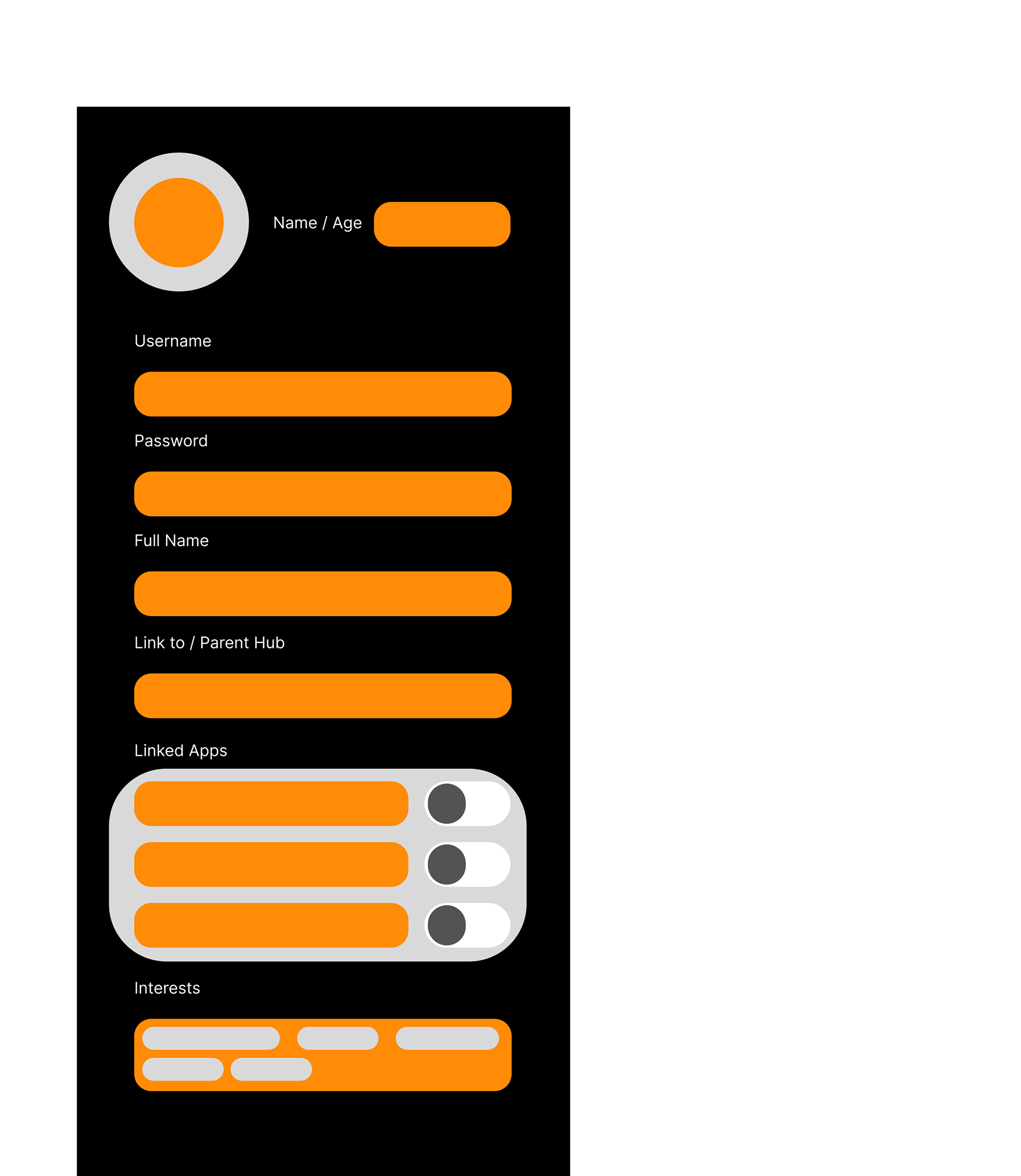
Profile Section

Mission Statement
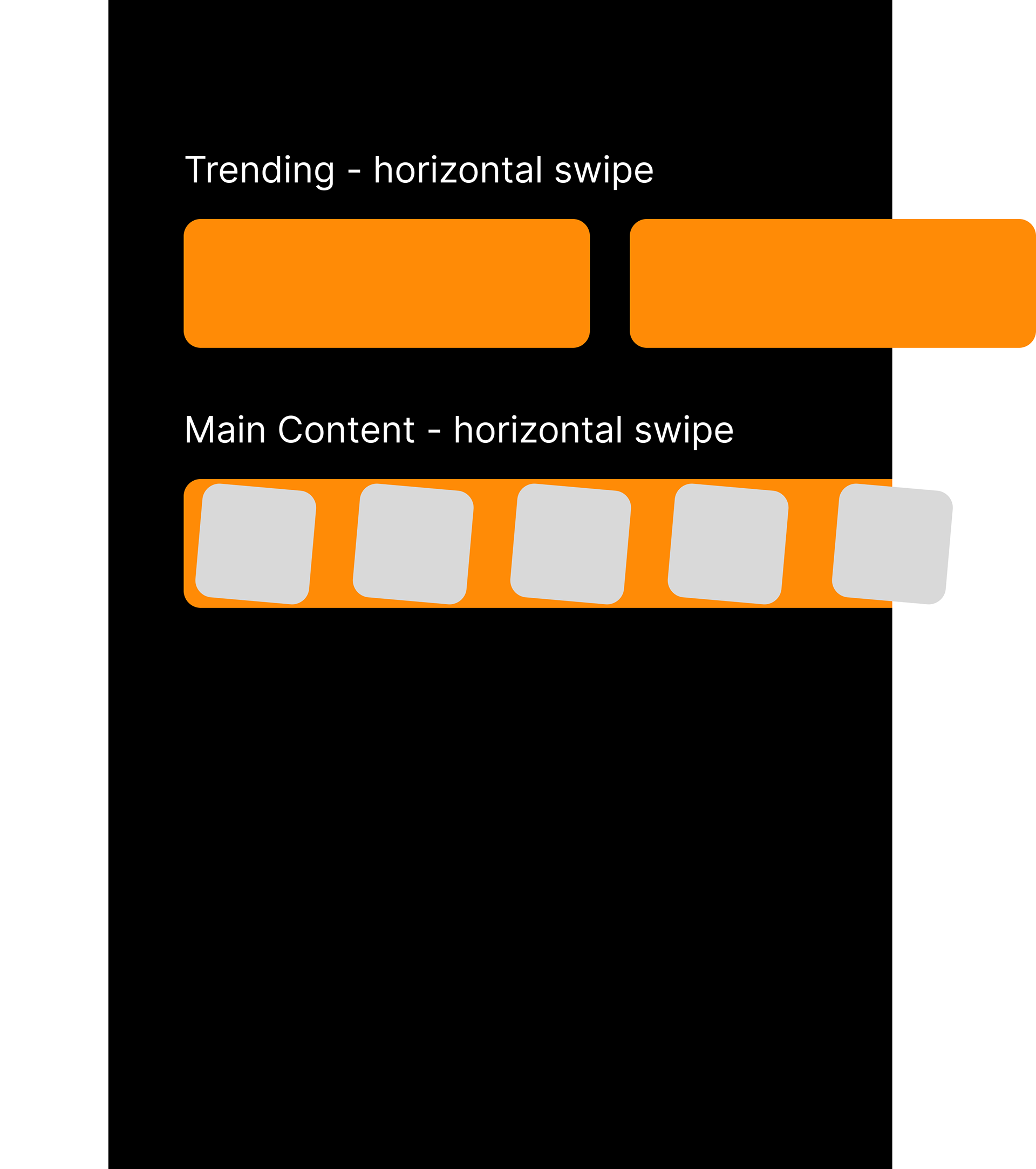
Trending Page + Apps
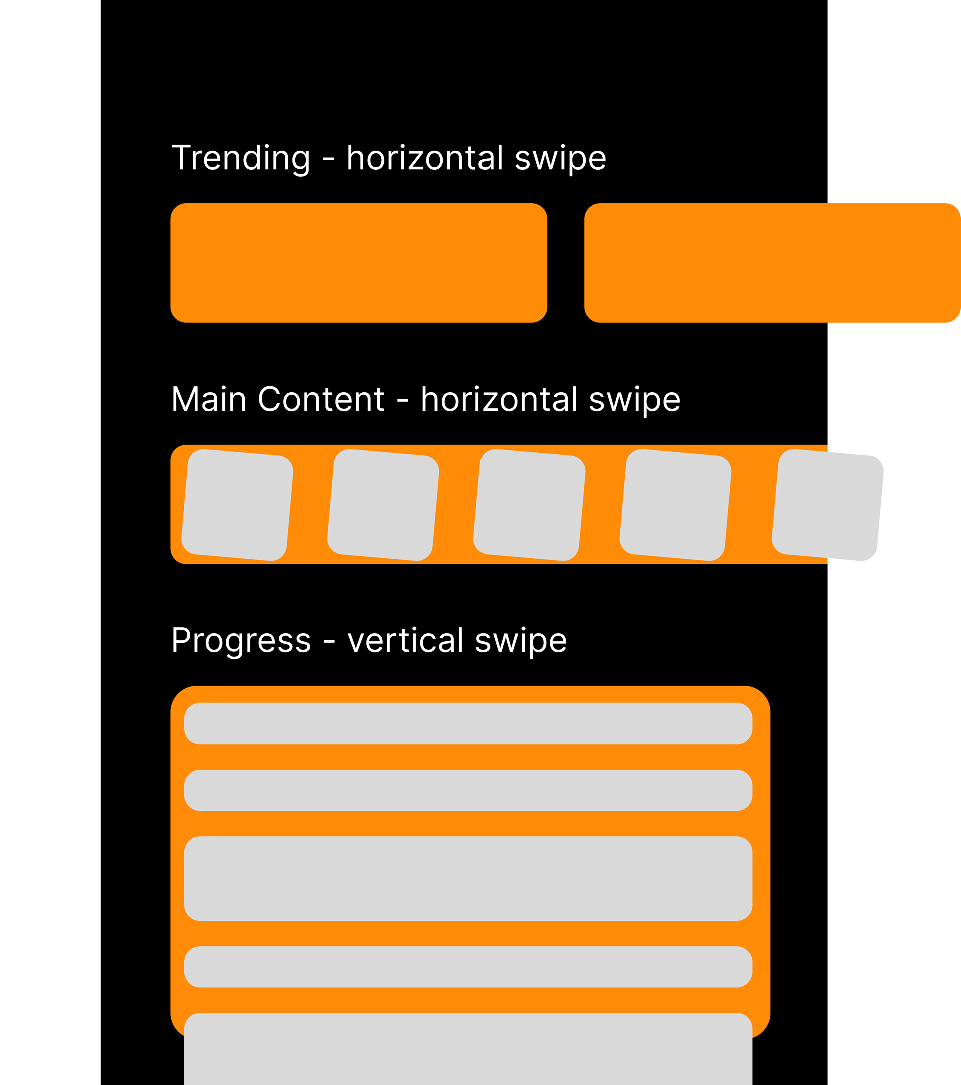
Child Progress Journal

AI Function
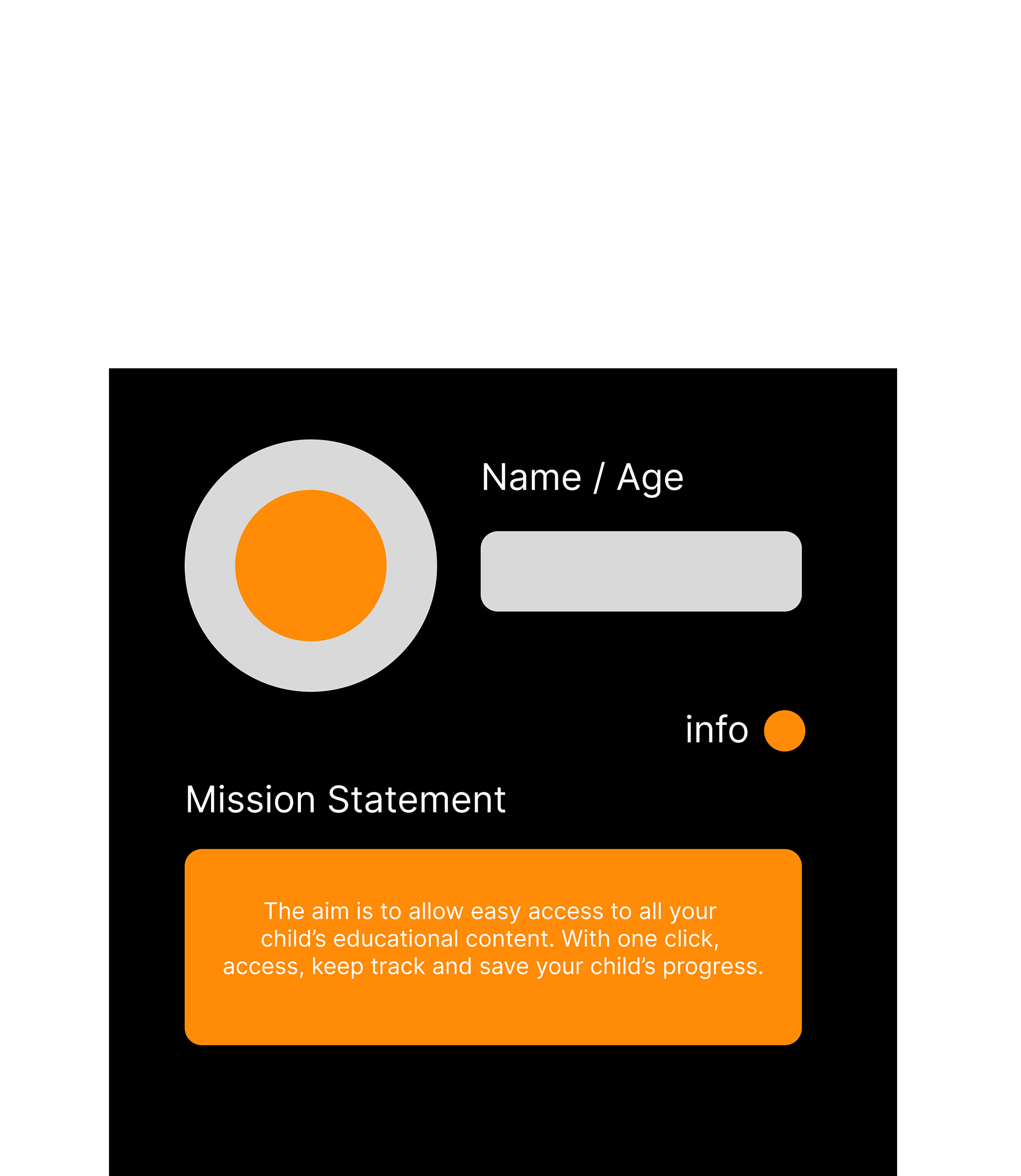
Information of the Day
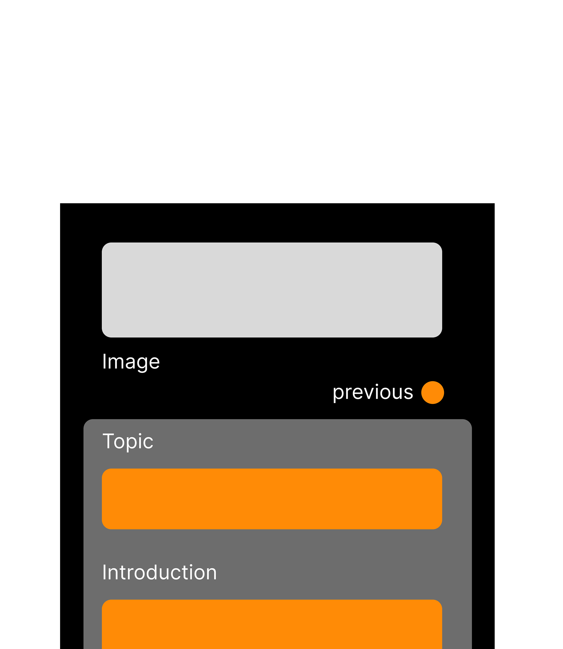
Daily Info Image + Title + Intro
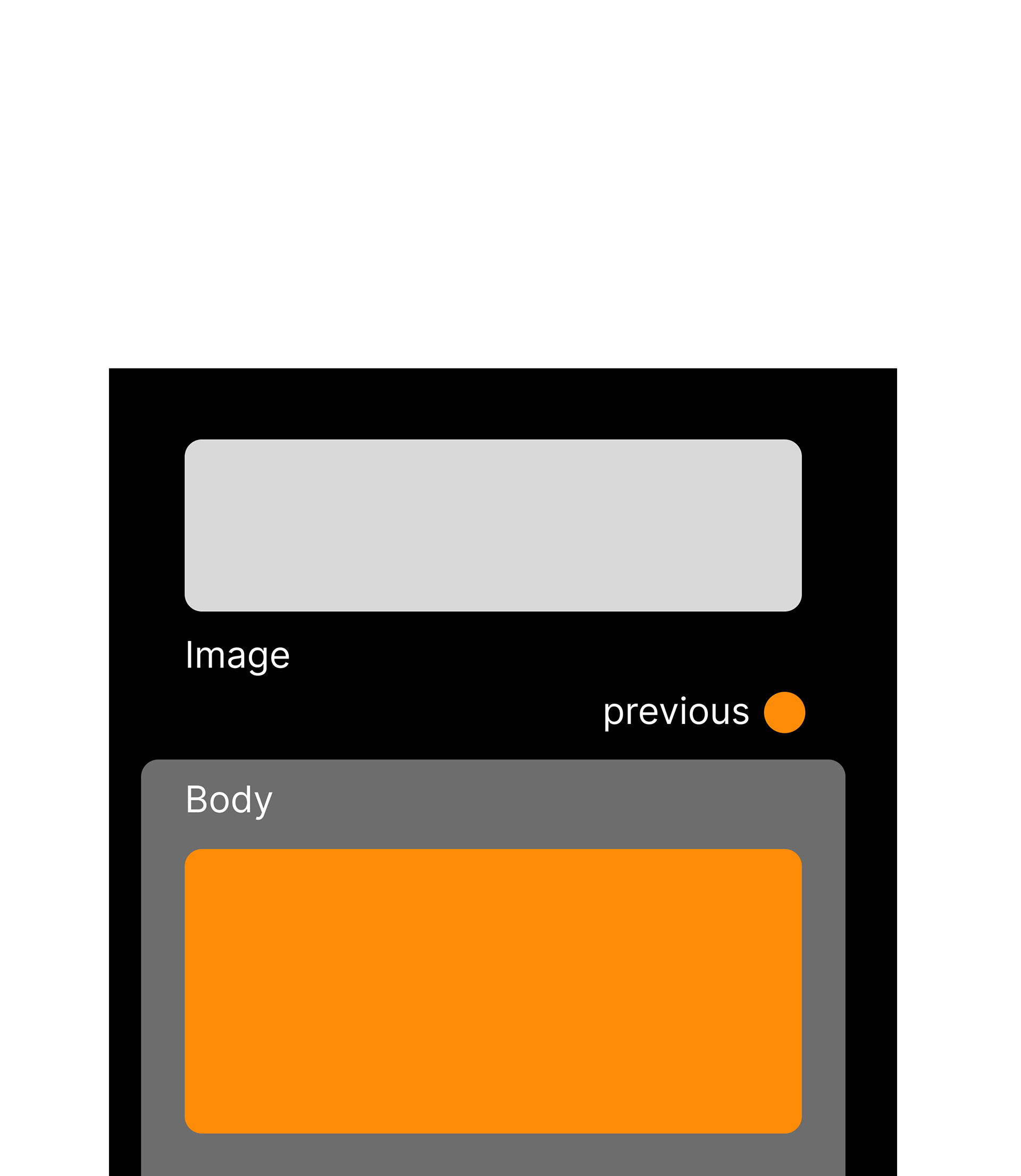
Information Body
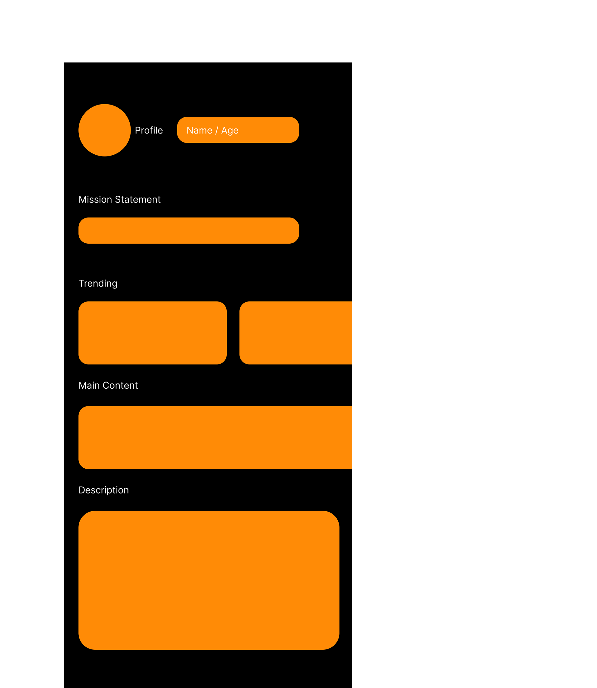
Landing Page
In the above, a bento box style systems map technique was used to create my prototype base layer.
Below is the research process:
Please click to zoom in.


Below is the development process:
Please click to zoom in.
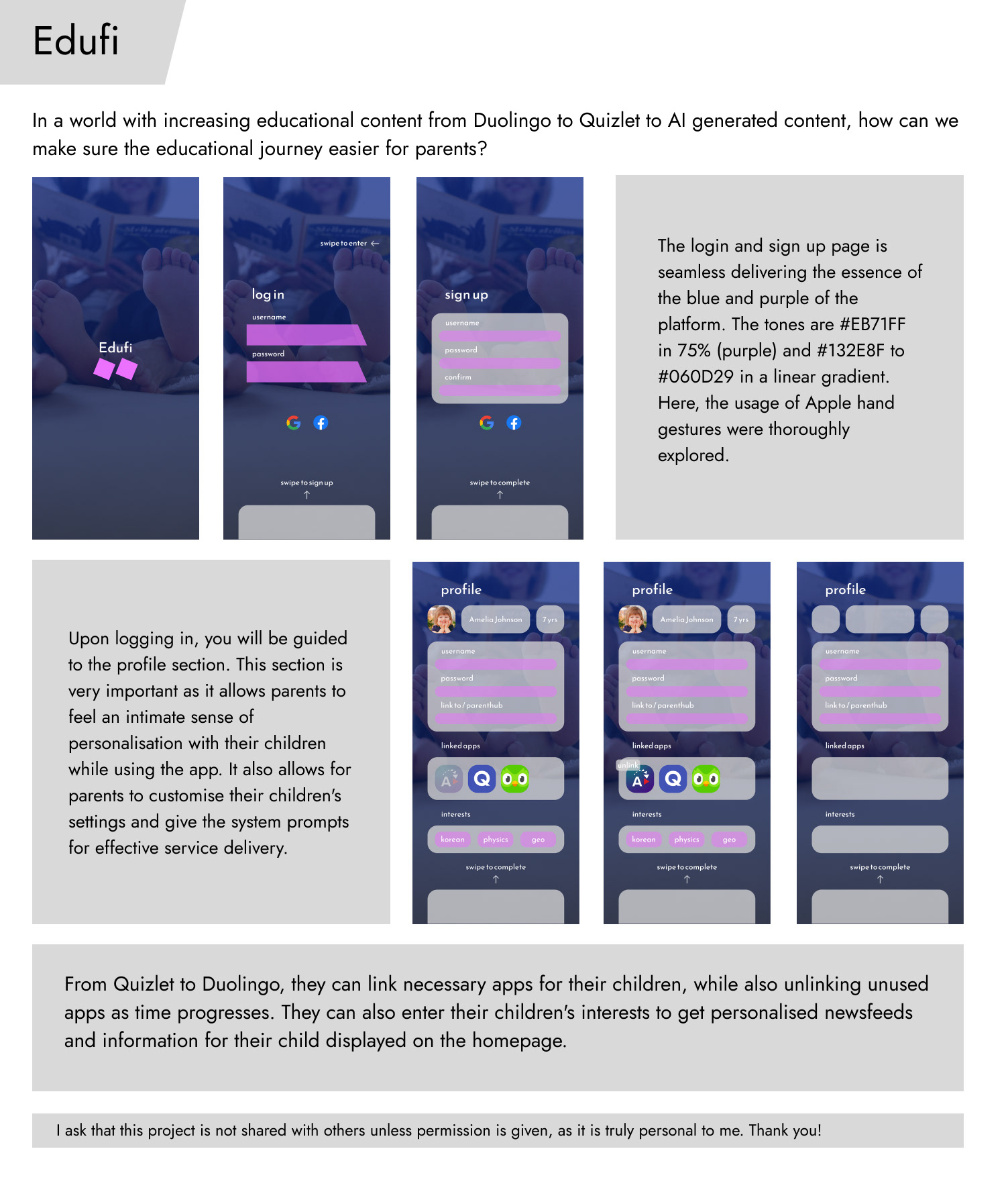
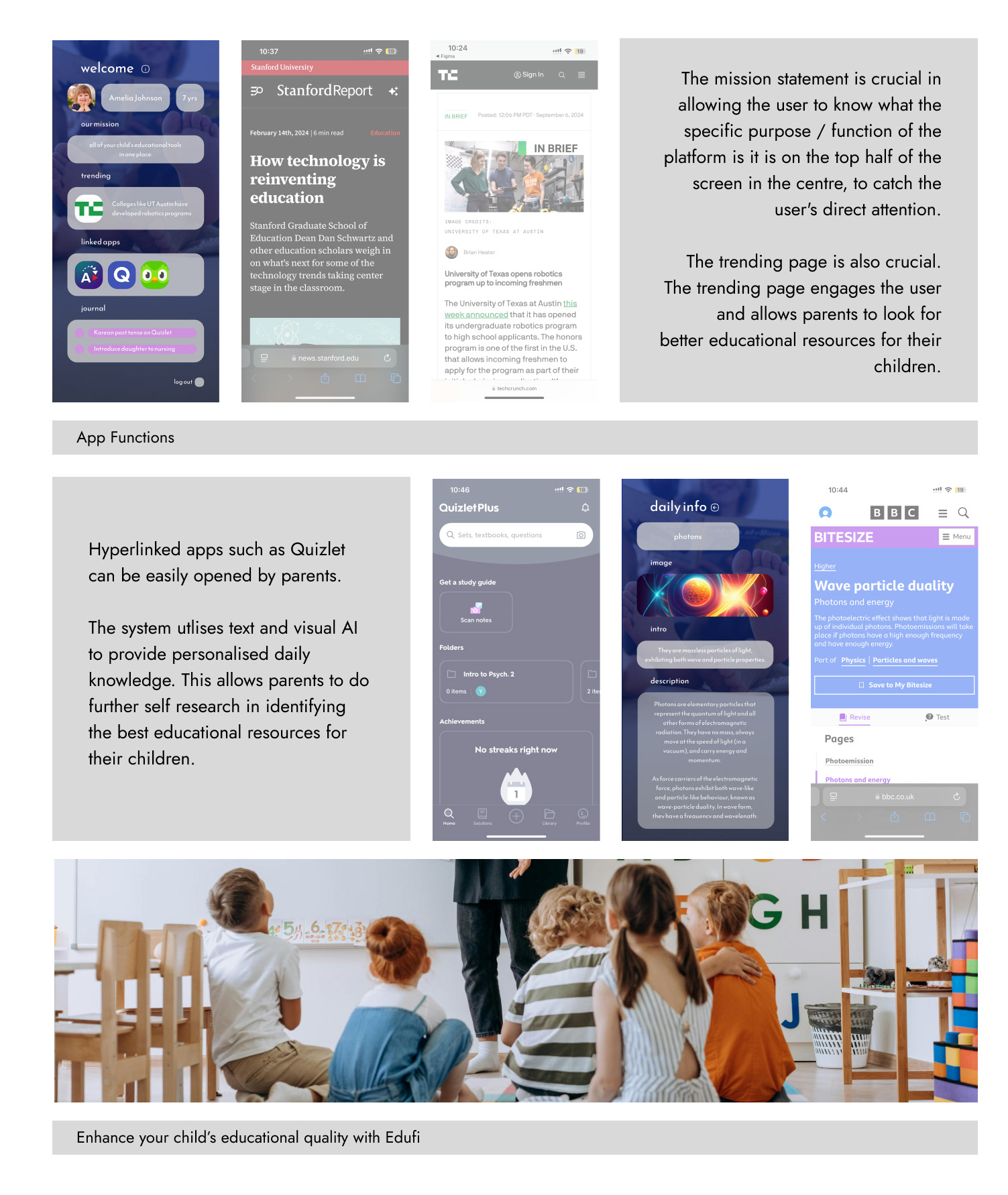
Below is the prototype walkthrough.
